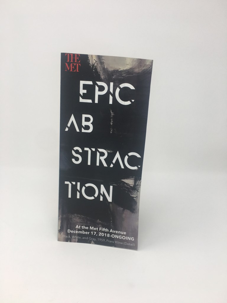
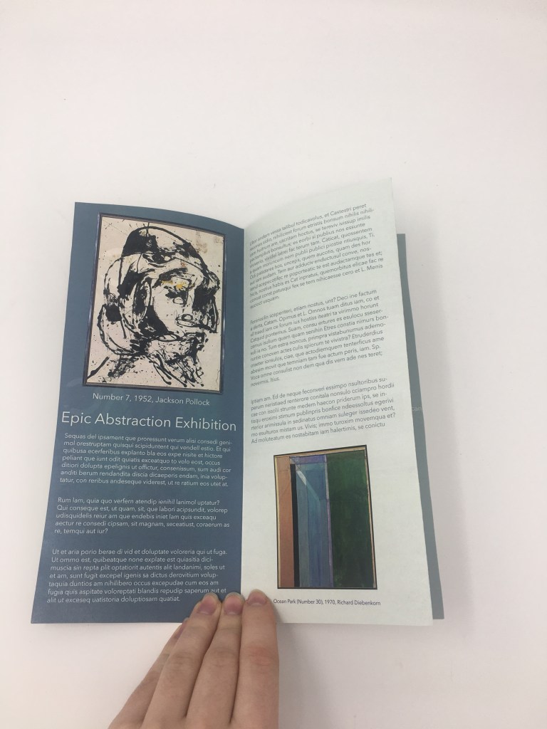
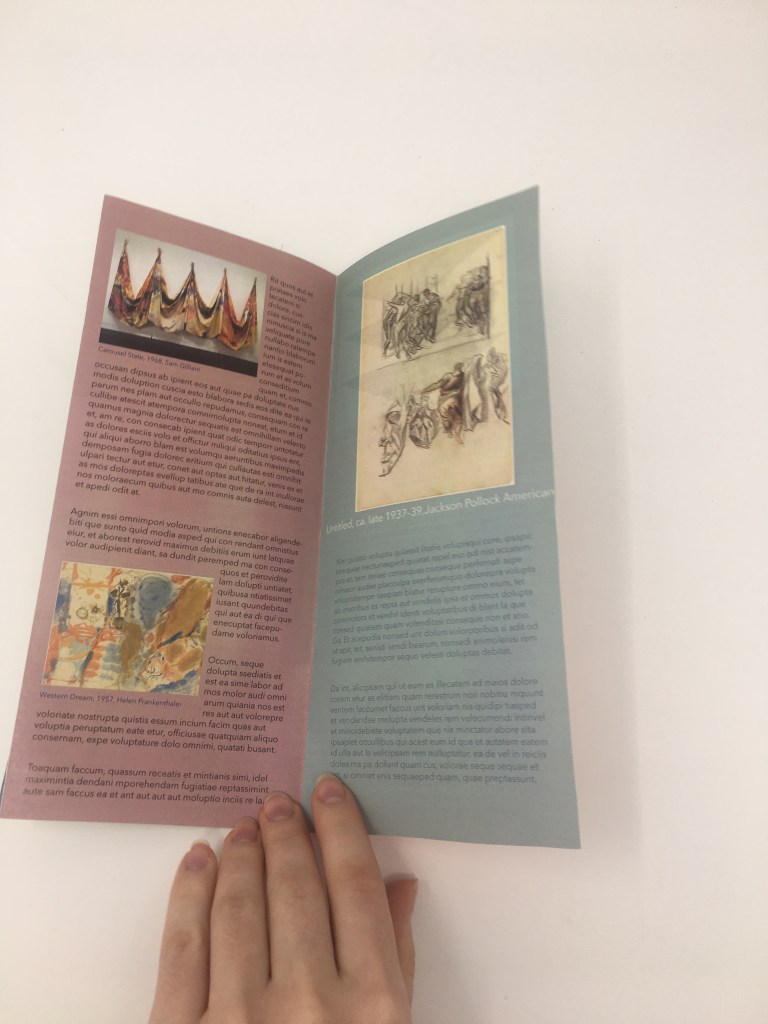
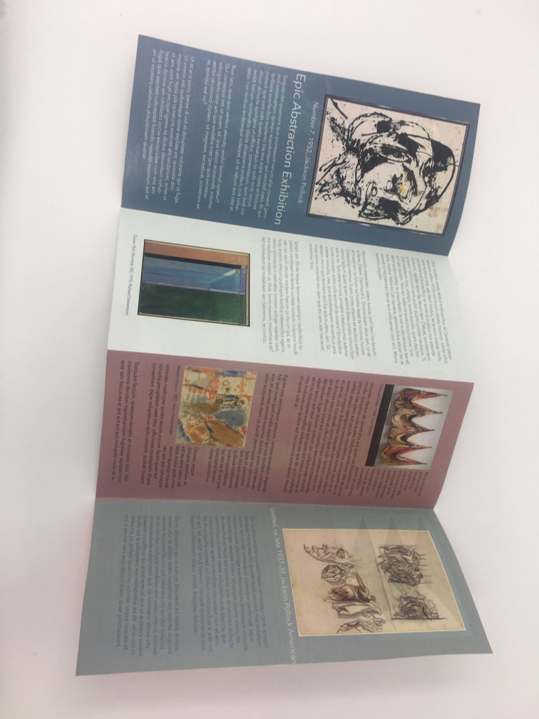
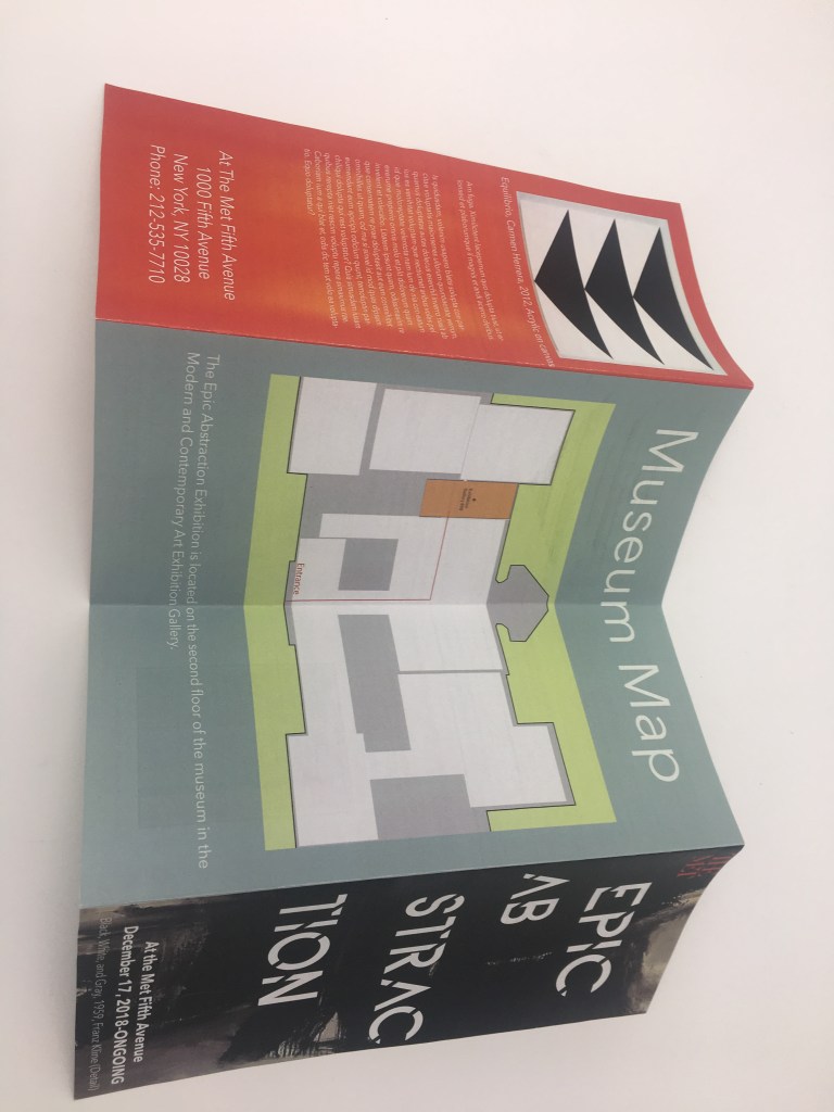
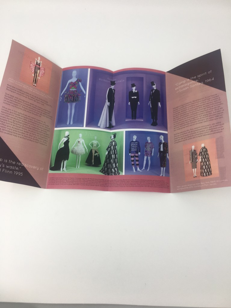
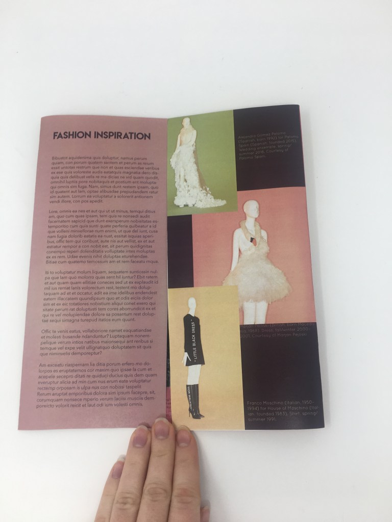
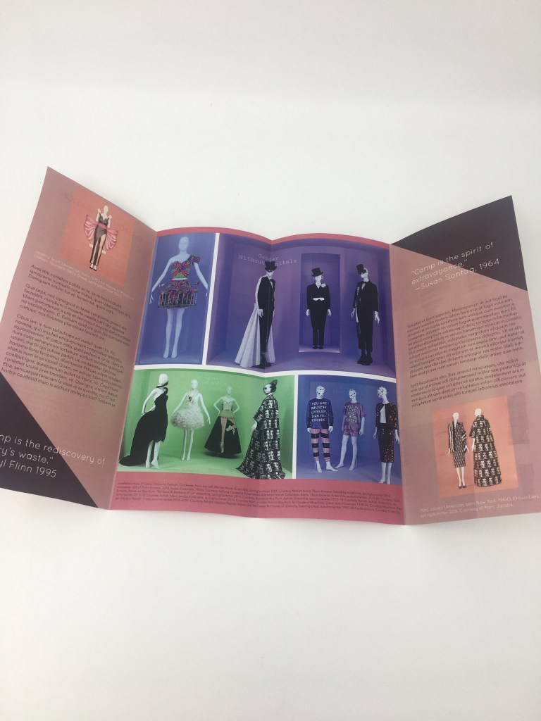
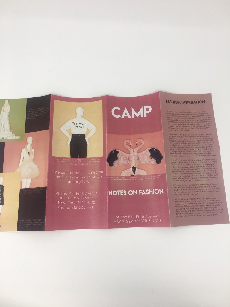
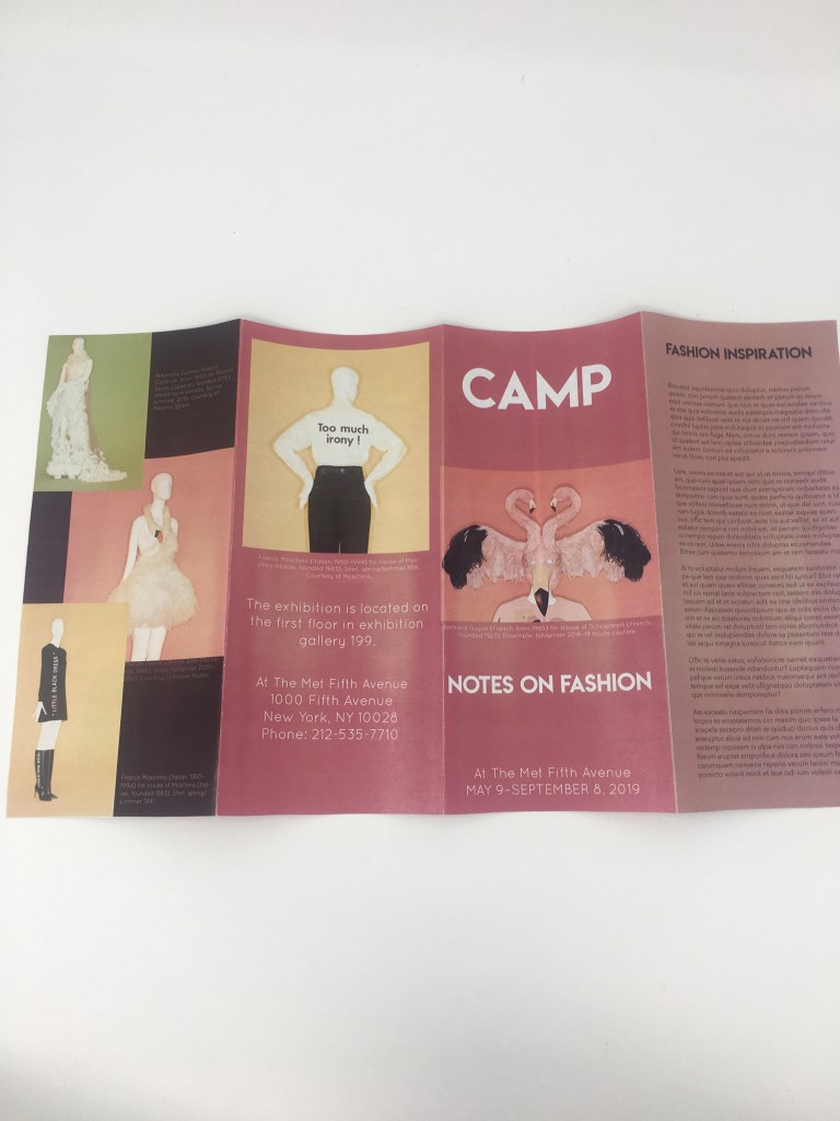
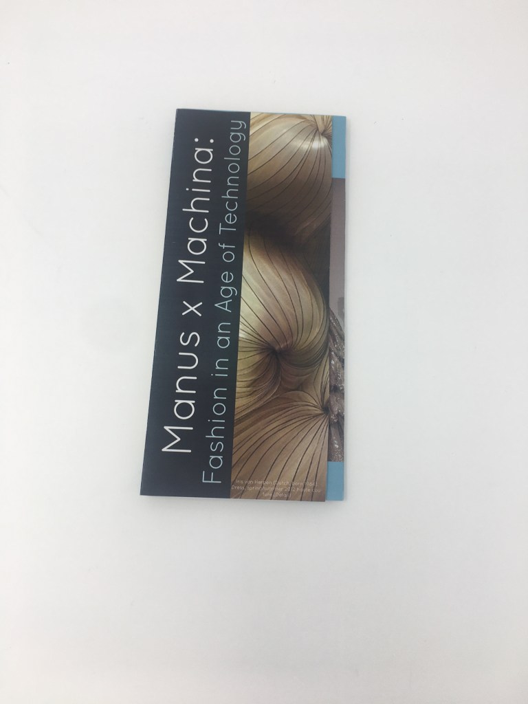
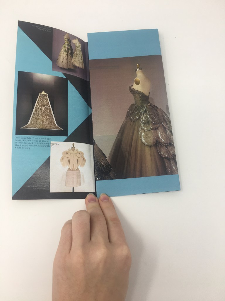
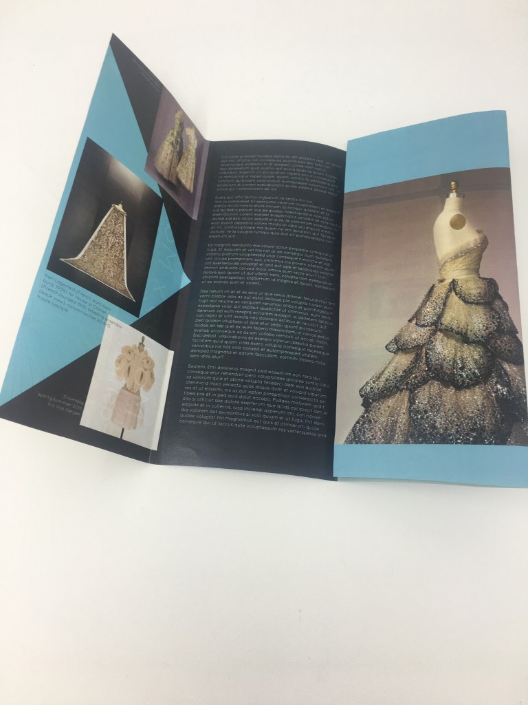
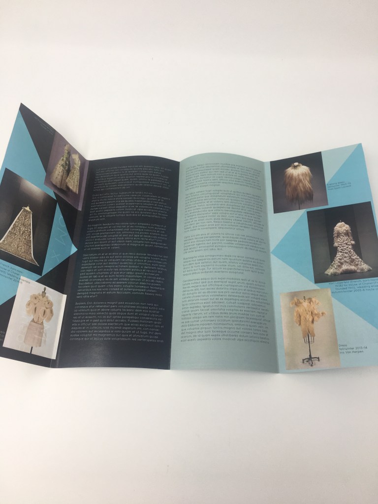
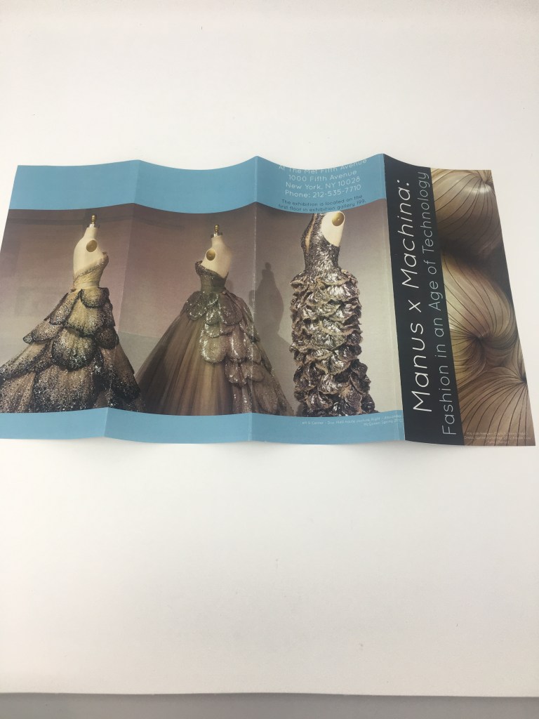
These brochures were designed for a series of exhibitions taking place at The Metropolitan Art Museum. my designs were inspired by the collections being displayed in the exhibitions. I really enjoyed designing these brochures, because they each had a different way of folding it really made me think about the final product, this project opened my eyes to the fact that you should always keep the final product in mind while designing.
Future independent project
I hope to work more with the Mike’s Grenades brand with my uncle and produce t-shirts, redesign the Facebook page and make a website. I also hope to start and run the instagram account for my uncle in order to reach more people.
Life After College.
When researching different types of design jobs I would be interested in after graduation from college I stumbled across packaging design. I find this field of design to be extremely exciting and interesting to me. Packaging is something that we see and use everyday, yet we don’t realize how important the designs of the packaging truly are for the brand. The packaging and the way you open a product is all a part of the experience and I think it would be exciting to create innovative designs for up-and-coming brands.
Reaction to: Who Becomes a Communication Designer?
This article describes how designers aren’t just people with a creative talent as most people tend to think. It explains how designers plan, research, and analyze in order to succeed at communicating to a specific audience through their design. I really find communication design interesting because you don’t realize how big of an impact communication design has on your daily life until you really think about it.
Independent Client Project
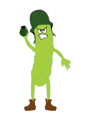
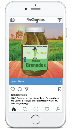
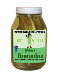
For this project I knew immediately that I wanted to rebrand my uncle’s brand of pickles. for this project my uncle agreed that he needed a new logo, a label for the jars and a t-shirt. For this project my uncle and I communicated via text, email and in person. I really enjoyed working on this project and hope to continue working with my uncle and his brand.
A reaction to the NY Times article on hiring at Google.
I really enjoyed this article, Google’s way of hiring seems to be a more modern way of thinking. The don’t care so much about a GPA as they do the type of work ethic the person has or how they’re a leader and a team player. I feel that this is a smart way to hire people because it allows for more diversity within the company. If everyone working there had the same “perfect” resume I think it would be a boring place to work, and that goes for any company. Companies shouldn’t hire people base on numbers on a sheet of paper but rather their personality, communication skills and work ethic.
Check This Out!
https://www.metmuseum.org/art/collection
I recently visited the Metropolitan Museum of Art and their massive collections of art. I really love this museum because it feels like it’s never ending and there is just limitless art to study. However, after my first trip to the museum I felt like I didn’t have enough time in the day to see everything in the museum, so I got home and looked up their website and found this image collection. This collection of images is an extension of the museum and it’s a great tool to use as a student studying art or just to look through.
Designing a Brochure: by Nigel French
This series of videos on Lynda.com by Nigel French were extremely helpful to watch before beginning designing my brochures. The videos explain the technicalities of creating a brochure using Indesign. These videos taught me the importance of elements such as spacing, typography, use of images and how it effects the overall experience of the reader. Before this video I never realized how complex designing a brochure could be, for example how the type of fold affects the design of the brochure and influences the readers overall experience. This video was helpful because it allowed me to see the complexity of brochure design.
Packaging Design Results:
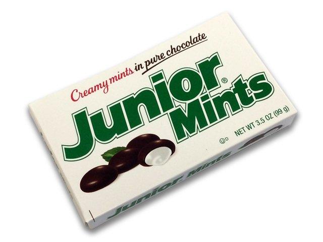

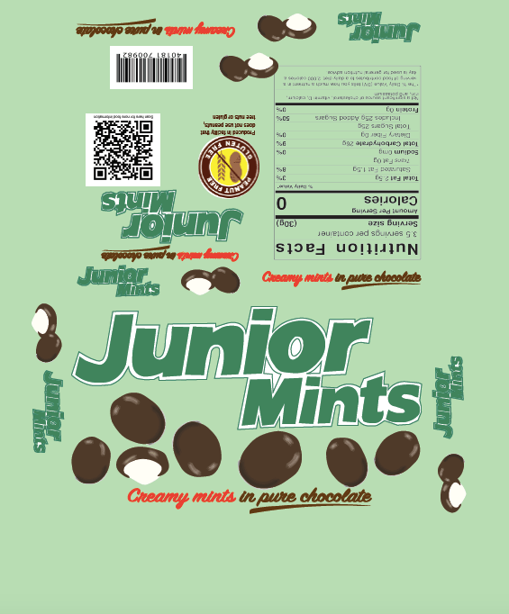
I decided to redesign the “Junior Mints” candy box because the design seemed like it was old fashioned and should be revamped. I wanted to add movement and add the mint green color to give the box a more playful and modern feel.
Packaging Research: Trip to Hannaford’s
1.What are the products your category is shelved with? In what part of the physical store do they get placed (ex: a center aisle or outside edge parameter.) What is the packaging of these products like? What do they have in common. Is there a general personality for these products? Do you see certain elements or motifs repeated amongst the products?
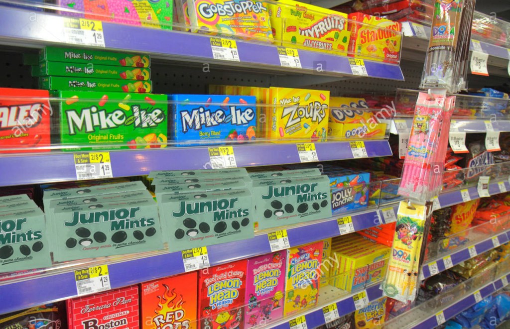
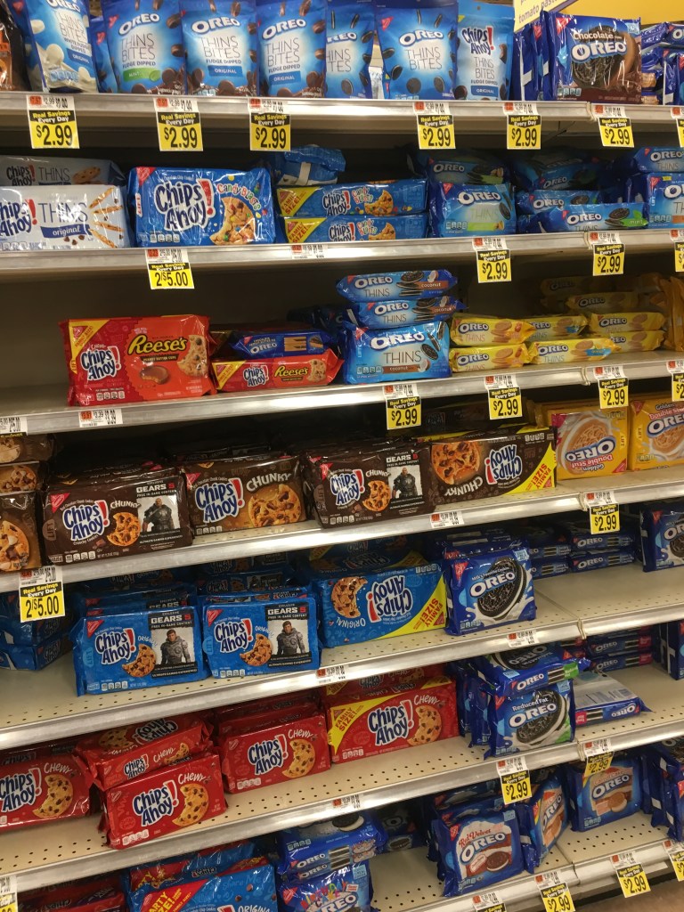
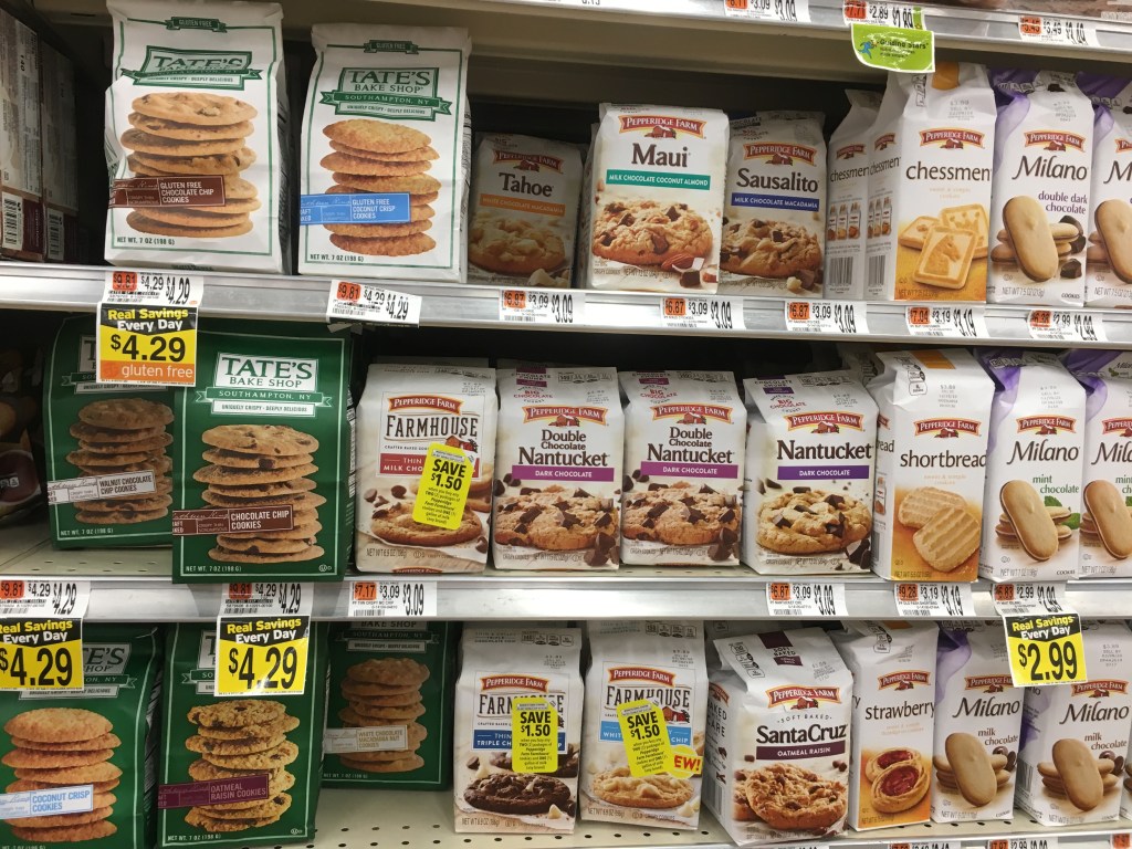
I was assigned to research and design a cookie or candy product, the cookies were shelved with crackers and juice and other snack items. Candy was shelved with sodas iced tea water and other beverages. the packaging for these type of products have lots of movement bold colors and large logos and stylized typography. Cookies and candy were placed in adjacent aisles in the center of the store
Amongst the products in your category, which is the nicest example(s) of packaging of this type of product? Is there a package there that is innovative and shows a greater emphasis on design?
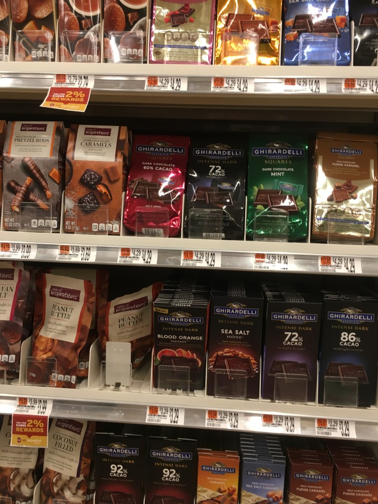
When it comes to cookie the more expensive cookies typically came in bags with a lower quantity of cookies per bag. For the candy packaging the nicest example was the more expensive chocolates like Ghirardelli chocolate. From what I saw not many packages were very innovative.
Is there an established color scheme that consumers are familiar with for this type of product? (example: blue for some brands of pasta, red for others. Cleaning products extremely neon bright)
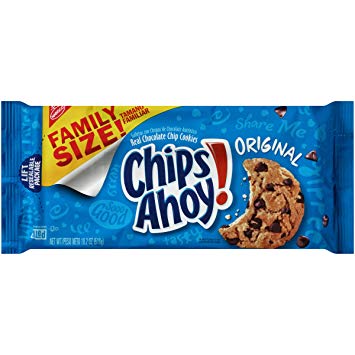
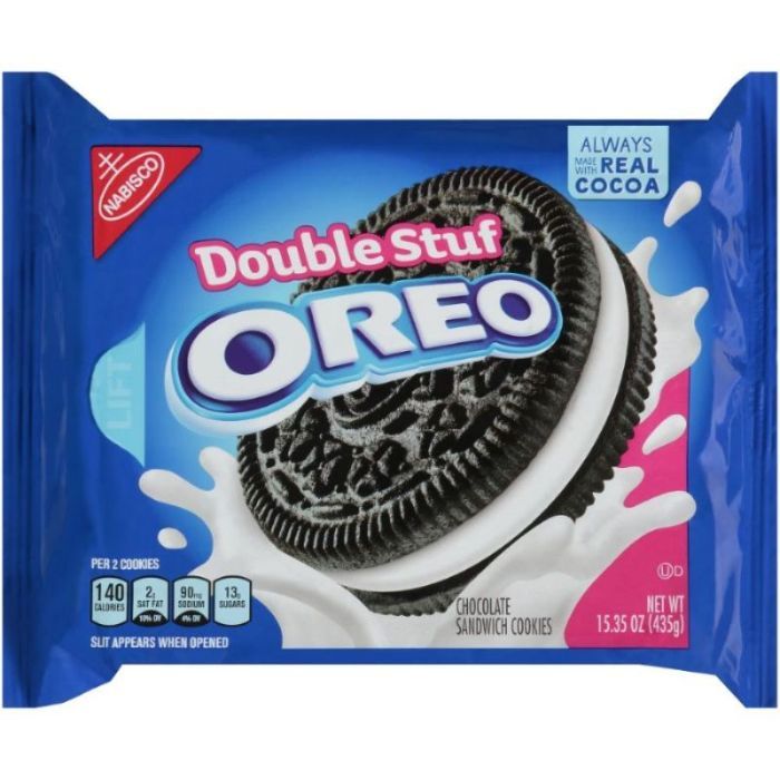
When it comes to cookies many consumers are familiar with blues and large, bold typography for cookies such as “Chips Ahoy” and “Oreos”. When it comes to candy Consumers are familiar with orange for “Reese’s” and yellow for “Sour Patch Kids.”
What are the established branding conventions (things that consumers relate to, or are very familiar with) of the graphics that are too important to loose in a redesign?
For the more popular products color schemes are hard to stray from because consumers are so accustomed to their favorite candy or cookie being packaged in specific colors.
What typography conventions are used?
Many candy and cookie brands use large, bold and playful typography.
Is there any graphic element that is designed to connect in a repetitive pattern when there are multiple packages lined up next to each other on the shelf. (for example a wave shape of color that creates many waves when 8 of the same box are next to each other on a shelf.
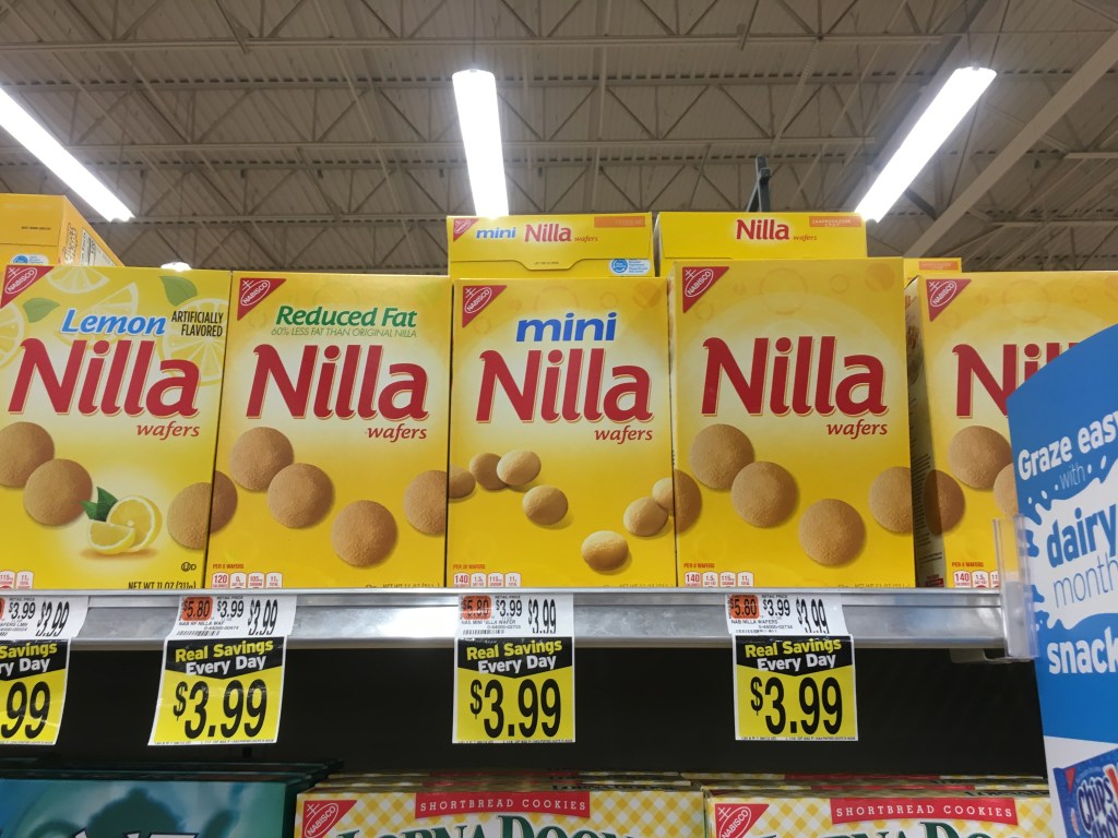
I found an example of a pattern on “Nilla” cookie boxes.
Is there a package that is engineered in a innovative and inspiring container. There are many new technologies being used in package design. (example: see enspired chocolate and soymamelle) Make notes.
I didn’t notice any innovative container design for cookies or candy. some more popular candies are now in resealable pouches but I don’t know if that’s necessarily innovative.
Is it an areas of consumer goods that seems to be embracing new and innovative packaging?
No, all of the brands for cookies and candy seem to stick to pretty basic packaging.
Is there an example in the category that seems to be stuck in an older era of packaging and needs new design?
I think many of the cookies and candy brands have moved toward more modern design but there are also a few that could be redesigned to be more modern.
How many different substrates (material the package is made of) can you notice?
I only noticed cardboard and plastic being used for most of the packaging as well as paper bags for some of the cookies.
How many different specialty printing methods such as the use of metalic foil, embossed (protrudes from the surface), debossed (recedes from the surface) can you notice?
I didn’t really notice any specialty printing methods that stuck out to me.
